 I know your stuck on selecting the best colors for your website design projects. I talk to people all the time that are struggling with this problem.
One of the hardest parts to laying out a website is choosing color combinations that work well together. I don’t know how many times I have developed a website for someone and we spend days and sometimes a week tweaking colors. A lot of the times people have ideas for colors for websites that simply clash, or don’t look good together. You probably know what I am talking about; blue, bright yellow, some off orange, and pink. When you see it, it’s an eyesore. After reading this article, you should have a better understanding of how to make your colors work for your website.
First, identify your market. Are you doing a bed & breakfast website? If so, pastel colors or something light and relaxing will work for you. If you’re doing health supplement website colors that say “energy” and “well-being” are a better option. If you’re doing a spa website, the main goal should be a relaxing color combination; like blues and colors that relax the user. So ask yourself this one simple question; what feeling does my website need to have? When I go there, do I want to be excited, relaxed, etc?
So What Do Different Colors Mean?

- Warm colors. These are your reds, yellows, and oranges. They evoke warmth.
- Cool colors. These are your blues, greens, and purples. They evoke relaxation.
- Neutral colors. Don’t forget about these. They are your grays and browns. Just means they don’t suggest any emotion.
It’s important to note that warm colors push forward while cool colors reside to the back. Therefore, if you’re designing a website you would want to use cool colors in the background and use your warmer colors on elements you want to jump out at your visitors. Be careful not to fall into the trap of making to many elements jump out, though.
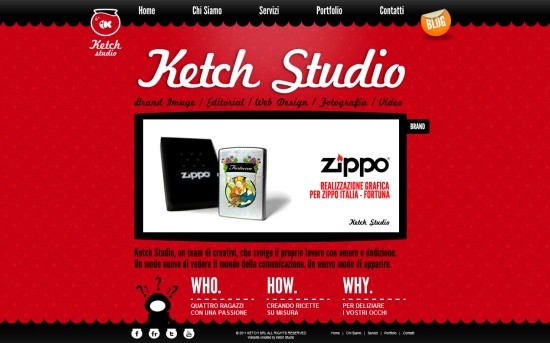
Red

Red means power and passion. When people see these colors, it stimulates energy and excitement in their brain. In other words use red sparingly, as too much red can be very overpowering.
Below are a few websites that use red effectively:

Orange

Orange means happiness, joy, and .”. It’s considered to be a “cheerful color”.
Here are some good examples of websites that use orange correctly:


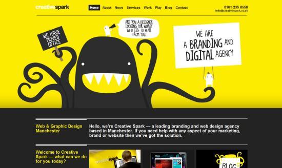
Yellow

Yellow means joy, intelligence, energy, happiness, and optimism.
Down below are a few sites I like that use Yellow.

Green

Green means nature, healing, growth, and harmony.
Here are a couple of sites I like that use green:


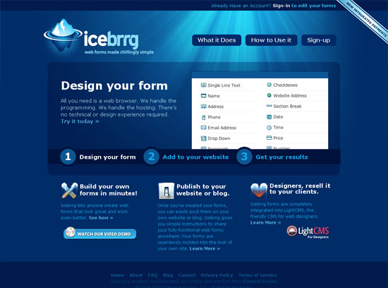
Blue
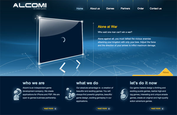
Blue means calming, exuding stability, trust, dependability, and expertise.
Below are some sites I like that use blue:
Purple
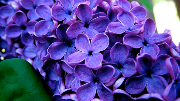
Purple means luxury, spirituality, and creativity.
Here are some sites that use purple effectively:


Black

Black means elegance, power, depth, and sophistication.
Below are some nice sites that use black:


White

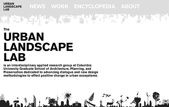
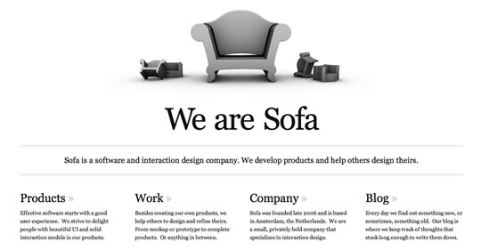
White means purity and innocence, safety, and cleanliness. Make sure you use white space on your website. I have always liked sites that properly use white space.
These are sites I like that use white correctly:
Picking The Right Color?

The next thing I do is go to https://www.w3schools.com/html/html_colors.asp because they list many web safe colors that you can choose from. I like how it shows the hexadecimal of the color right next to it. Granted they are not all on there, but this gives us some kind of starting point. You need to identify which dominate color you want. Don’t worry about all the supplementary colors at this stage. Just focus on the main color you want.
So let’s say we chose #D80000 which is a red color. We need to decide then what works well with that color. Often times you can go about this many different ways. Remember that you can always choose a color and then supplement it with either black or white (sometimes both).
Putting Together Colors
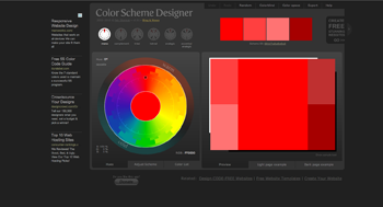 Now that you have chosen a dominate color you can easily build a color palette that works. One site I really like is https://colorschemedesigner.com/ because you can put in your hexadecimal color and build a color combination with the following color schemes; monochromatic, complementary, triad, analogic, and accented analogic.
Interesting articles on colors and conversions:
https://www.quicksprout.com/2014/01/24/how-colors-affect-conversion-rate/
https://optinmonster.com/which-color-button-converts-best/
Interesting articles on colors and websites:
https://www.websitebuilderexpert.com/how-to-choose-color-for-your-website/
https://blog.crazyegg.com/2011/12/30/pick-website-color-combination/
Remember that picking the correct color palette for your website is vital to your site’s success. Don’t forget to ask yourself does this work for my industry. As you can clearly see choosing, the right colors can go a long way!
Very Informative post. I especially liked the pictures, representing colors in different forms, such as cold/warm versus neutrality. That was a really eye-opening point for me. Thank you for this great and interesting article!
Garen, thank you for this post. This is one area that I’ve ALWAYS struggled with. I’m color blind, not completely but with certain colors (I’m a protanope).
I don’t know if it’s a result of that, but I have a terrible time actually picking out complimentary colors. That’s one of the reasons that I like this article so much.
The explanation of the actual colors and their meanings helps those of us (like myself) that are color challenged to at least have a snowballs chance in…an oven, to consciously attempt at helping convey our meaning.
The color tool you linked to is great because it pretty much gives you a finite number of options to pick from for complimentary, adjacent and dissimilar colors.
In your opinion, what considerations (if any) should we take into account when thinking about those that are color challenged like me?
Well, there are different degrees of color blindness.
Protanomaly. Red, orange, and yellow appear to be greener. So this makes them not so bright. Might consider not using lots of bright colors.
Protanopia. Can not see red. Red will look like black. Also, shades of orange, yellow, and green will look like yellow. Might want to avoid these colors.
Deuteranomaly. Yellow and green appear redder. It is hard to tell violet from blue.
Deuteranopia. Reds are seen as brownish yellow. Green is seen as beige.
Tritanomaly. Blue will look greener. Also, it is hard to tell yellow and red from pink.
Tritanopia. Blue looks green and yellow looks violet or light gray.
I guess you could always develop a black and white version of your site if your target audience is colorblind. However, this probably wouldn’t be ideal unless you know it’s going to be a major problem.
Hi Garen
Thanks for all this information on colors. I really have to bookmark this and come back and read it again since there is just so much information here.
I heard recently that using blue will help with getting more conversions? Have you come across this belief before?
Using colors is something I need to spend more time checking out!
That is actually a great question. I did do some research on this because I am unsure about it. I did find this article:
https://blog.kissmetrics.com/psychology-of-color-and-conversions/
Actually, I would use bright colors for your calls for action. Blue would not be a good option. Blue is a cool color. Cool colors reside to the back. Warm colors push out at us. They grab our attention.
Hi. Very interesting. I was just about to write something on the influence color has in our lives when I came across this. I did study color theory in college. Depending on the industry that your market is in. It should determine what colors you should use. Makes sense that they would also influence our web site visitors. I can see why financial sites always use the color green.
Thank you!
Yes, it’s very fitting for financial sites to use green because it represents growth, healing, and harmony. However, a lot of financial brands also use blue.
I did come across this site which shows why they use the color blue:
https://blog.kurtosys.com/blue-popular-financial-brands/
Hey Garen,
After reading this post, I must admit, I feel like I know quite a bit more about the relationship between colors and websites than I did before, but I must admit, choosing color schemes is still one of my most challenging obstacles when it comes to building a website. Most of the time, I still go by gut instinct. Not sure if that’s such a great idea 🙂
For instance, my current pet project is called Stuff for Baby Boomers. It is a very broad niche, and I’ve always felt that the mood I wanted to convey is multicolored – like the tie-dyed tee shirts that were so popular in the 60s.
Thus, I created my background using an extreme closeup of a tie-dye image, added a Gaussian blur and then adjusting the opacity so that I wouldn’t be too stark.
My header text is tan. The main text is black, and borders are light blue. Personally, I think it works pretty well, but I don’t claim any real expertise when it comes to the use of color.
Although I’ve received many compliments on my homepage (which has a colorful montage of 60’s personalities and icons), I don’t know that any of those comments and messages are from visitors with expertise in your field. I’d be curious to get your input if you ever have a chance to visit, please don’t hesitate to comment on my site’s overall appearance and color scheme.
Sorry if I went on too long. I am impressed by your article, and you come across as a very good authority on the subject. I will bookmark this site for future reference!
Thank you,
Hal
I go with my gut instinct on a lot of things. So, I understand.
Yeah, a lot of people really don’t understand color theory. Thus, when they go to develop a site, they get the colors horribly wrong.
However, with your site stuffforbabyboomers.com you have nailed the color pallet. Also, you have nailed the typography for your site, too. It’s very fitting for baby boomers.
The only thing I would change is your SUMO ME plugin gray color for your email marketing opt-in newsletter. I would go with that orange color that you’re using for your sites logo. It would make it stand out more. That and orange isn’t an overpowering color. A lot of people try to use red for attention grabbers on their sites.
First I would like to say that I appreciate how you broke down how color affects the psych of visitors and how they engage within the page. Being that you are a designer of 10+ years, it has to be a formula to why certain colors appear on a page. So would you say that color even affects the smaller areas of the page? Example, your page is mainly Blue and white, which can be said you are trying to get visitors to portray your message as pure, whilst giving them the feeling of being dependable information. On the contrary, your bio information is surrounded by a yellowish border, yellow inducing the feeling of joy and optimism. Is this done on purpose? Sorry for the lengthy post I am just very curious because this is very intriguing.
Yes Razhede, I planned that out when I developed tbwhs.com. Blue is one of the most used colors for websites, too. Effective use of white space is also very important too. Usually, when a site doesn’t use whitespace effectively, it is a terrible eyesore.
Here is a good article I found on white space:
https://blog.teamtreehouse.com/white-space-in-web-design-what-it-is-and-why-you-should-use-it
This is fascinating Garen. I believe you when saying that choosing the right colors for your website is vital to your site’s success. Colors evoke emotions in the reader, and the different effects that colors have on people should be taken into consideration when building a site. The color of your site is the first thing that catches your audience’s attention, and the colors that you choose should stir in them the reaction that you aim to get.
This is so informative I have bookmarked your post as I will be referring to this as I create more websites in the future. You are indeed truly an expert in your field. Thanks.
Correct, people are very quick to judge stuff online. Web sites are certainly no exception. It is so important to choose the right color because people have very low attention spans. This is very true online. I have heard that people have an average of 7 seconds to decide if a site is worth staying on or not. Therefore, you can see just how important choosing colors are for your website.
As a site note, you want your site to load quickly, too. One tool I use it GTMetrix because it shows you exactly how long your site takes to load. Typically, I tell people to aim for under 3 seconds if they can.
This is great information. Thank you! I am really stuck on the color issue for my site.
My site background is white. Would you suggest sticking with black for the text in sidebar widgets? I wonder if readers who have a hard time seeing will be able to see the text using #6BA6A7 which is what I use. I don’t want them straining to see.
Thanks for the post! I’m glad I found your site!
Wendy
I would highly recommend that you don’t use that teal blue color for your typography. Especially for your body text. It’s okay to use it for H1, H2, etc. but I wouldn’t use it for your body text.
For the sidebar widgets, it’s fine to use that teal color. Would certainly spice it up.
Wow, this is a very detailed article. I see the white is the best for backgrounds. Seeing how it is a neutral color. But it usually looks flat to the site owner especially if is a site done for a client.
Thank you greatly for this post.
Thanks.
I agree that white might look kind of plain. But, from a design and usability aspect, it is something that needs to be done. Here is one trick I use when designing a site for a client. First, I will show them the way they wanted it. Then I will show them a different version but use a couple elements they requested. I don’t like putting my name on poor web designed sites.